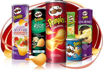
PRINGLES
COLOUR
The colours of package are very vivid for example: vibrant red, dark purple, harsh and very eye-catching. Every colour goes together and these are suitable to the flavours of the product. Colours and the pictures adapted on this package trigger people’s imagination. The colours grab the customer’s attention by the fact these are so different than the other crisps. The different colours of packages suit for a party, friends meeting or just to make people happier. The vivid colours are noticeable for children as well.
FONT
Logo font is big enough to see this. It is yellow and very noticeable. The font of the flavour is always big, white and attention-grabbing which lets people find the flavour very fast. On the back of the package the font is very small, straight- line, white and easy to read. It is really clear and looks aesthetically. This gives a very posh look. A little bigger is the font of the brand website ad it is in the middle of the package. The producers use the package to advertise the website which can help people find out more information or curiosity about the Pringles. On the bottom font is small and black which stands out more. The font of the weight is big and easy to see so people who are on a diet can find easily this information.
LOGO

The logo appeals mainly to young people. The logo is the characteristic, cartoon, a male face with a big moustache, parted bangs and funny eyebrows, which everyone knows from advertisements. It goes with the big yellow caption of the brand name “Pringles”. It is very eye-catching and is located in the front of the package. Customers the logo can find on the back as well. It is a little bit smaller than this which is on the front but the logo is same eye-catching. The logo is never changing. The characteristic logo is a very eye-catching for children and for young people. Because of the colours and the logo this package is perfect for parties. Pringles can be ideal as a gift for children or young people as well.
MATERIALS
Pringles are a tubular card-board which gives a good look for this. People cannot recognize that it is carton because it looks too good. Inside the package is a foil-lined. On the bottom there is some metal which gives illusion that this entire package is done from this. The lid is done from the plastic. Everything together gives nice and very professional look. It doesn’t look like the normal crisps opaque. Pringles looks very expensive and people who like luxury would choose this package of crisps.
INFORMATION
From the package of Pringles customers can find a lot of information. On the back of the package people can find the information about ingredients in different languages and the brand website. This information lets understand ingredients for different nationalities. On the bottom customers can find the average of nutrition information. At the side clients can find the flavour information and how many calories it has and how much it weights. Information which it gives for people is that this is suitable for vegetarians which are quite important information for some people. Many different crisps opaque does not have this information. On the package customer can find everything what need and what is the most important.
SHAPE
The shape of the Pringles is very eye-catching. It is very different from the other crisps. It is very big and it takes much more space on the shelves than the other one. This attitude lets them take more shelves and this makes people buy it. Everyone can see it from a big distance. The package is round and it can stand by itself. It is very big like for the crisps package. The shape of it looks very interesting and exclusive because of the solid and nice appearance.
ERGONOMICS
Pringles are done to be eye-catching for everyone. The shape of package stops from broke the crisps. Because of the lid thee crisps are fresh all the time. The special shape of these crisps makes them special. It can’t be done in the normal package of crisps. The shape of the crisps is very characteristic than even without the package people can recognize them. The shape of crisps is saddle which let them stand neatly in the pack.
The package is a tube. The package is very interesting even without the crisps. When the crisps have been finished the children can play with it. When people press the package the lid jump up what is quite funny. This attitude gives the happiness for children, teenagers and for adults sometimes as well.
COPY
Everything on this package is clear and tidy. The pictures, the print makes these crisps tastier. The pictures illustrate with the flavour like for example the picture of a barbeque on the “TEXAS BBQ SOUCE” package. The pictures have influence on people’s taste imagination. Customers want to try the flavour which is shown in such a nice way.
BRAND NAME
Pringles are a very well know brand from the advertisements. Everyone can recognize the characteristic logo and the shape of the package. The brand name is a very good for children and young people. It is quite funny and does not mean anything. The brand name is very different than the other crisps and original and because of this it is quite easy to remember for everyone.
HOW IT GOES TOGETHER
The appearance of the package is very eye-catching. It grabs the attention immediately by the vivid colours, big and nice looking pictures. Everything is pleasant to look at and in the same time very interesting because it is very different from the other brands. Everything on this is well situated and it looks really aesthetic. The information which is on the package has everything customers need.
I must design logos of products etc., so I know the pain.
ReplyDeleteGood work - nice observation, describtion, I have nothing to reproach.
Tricky.
ReplyDelete